Tattoo ideas
Lettering & Script Tattoo Ideas
Lettering is deceptively the hardest small tattoo to get right, because unlike an image where minor imperfections just look organic, a misspelled or badly-kerned word is instantly, permanently obvious to every person who reads it. The style splits into font families with different personalities: fine cursive script (looping, connected, closer to handwriting, popular for names and short quotes), bold blackletter or gothic (the heavy, angular font associated with old-English text, pulling visual weight closer to traditional tattooing), and clean sans-serif or typewriter-style lettering (minimal, modern, popular for coordinates or short phrases where legibility matters more than flourish). Each font family has a different failure mode as it ages, which most people never think about until it's too late to fix cheaply.
Cursive script is the riskiest long-term choice specifically because the thin connecting strokes between letters are executed with fine-line-weight needlework even when the rest of the tattoo reads as bold — those thin connectors are the first thing to blur, and once one softens, letters meant to flow as one word can start looking like separate disconnected marks. Blackletter and bold block lettering age far better because the letterforms are built with thick strokes, closer to traditional tattooing's ink density, so a bold single word in gothic lettering can hold crisp readability for 15-20 years while the same word in delicate cursive might need a touch-up by year 5 just to stay legible. If legibility over decades matters more than the romantic look of script, say that explicitly to your artist and lean toward a bolder font family.
Placement comes down to a simple rule most people ignore: pick a body area that doesn't fold, stretch, or wrinkle in normal daily movement, because text is uniquely vulnerable to becoming unreadable when skin underneath distorts. Forearm, a small centered rib piece, collarbone, and the flat plane of the upper back are reliable; inner bicep and areas that crease when a joint bends are the classic mistake spots where lettering warps into illegibility within a few years even without significant fading. Pain runs low to moderate on forearm and upper back (3-4/10) and jumps notably on ribs (7-8/10, thin skin with little padding) — ribs are also where skin texture most affects fine linework, so blackletter holds up better there than delicate cursive.
Lettering & Script designs
Generate your own lettering & script design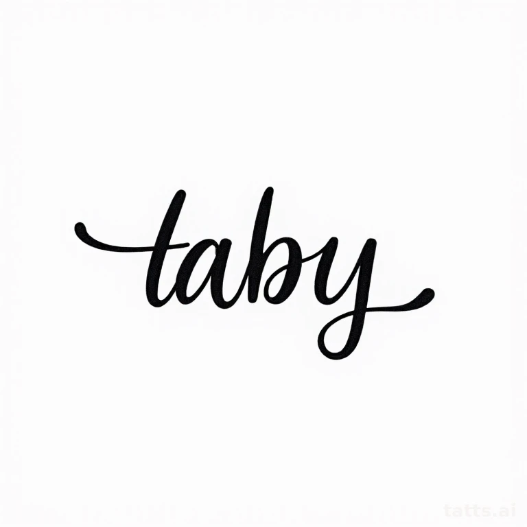


Proofread before you sit in the chair, not after
Tattoo lettering mistakes are almost always caught by the client, not the artist, because the artist is executing a design, not fact-checking a quote's wording or a name's spelling. Bring the exact text written out, double-check foreign language phrases with a native speaker (translation apps regularly produce grammatically wrong or culturally odd results for tattoo-length phrases), and have someone else read your final stencil approval out loud before the needle touches skin. A misspelled lettering tattoo is one of the most common and most avoidable regret categories in the entire industry.
Letter spacing (kerning) matters more in tattoos than anywhere else
Because skin isn't flat paper and stretches slightly during healing, an artist has to intentionally over- or under-space letters to compensate for how the design will settle once swelling goes down — a word that looks perfectly kerned in the stencil can end up with awkward gaps or cramped letters if the artist didn't account for placement-specific stretch. Ask to see healed (not just fresh) photos of lettering work specifically, since kerning problems are invisible on day one and only show up once the skin fully settles over several weeks.
Frequently asked
- Which lettering style ages best over time?
- Bold blackletter or gothic-style fonts age significantly better than delicate cursive script because the letterforms are built with thick strokes similar to traditional tattoo ink density. Cursive script's thin connecting strokes between letters are the first thing to blur, sometimes needing a touch-up within 5 years just to stay legible.
- What's the best placement for a lettering tattoo?
- Flat, low-movement areas that don't fold or crease during normal activity — forearm, upper back, collarbone, or a small centered rib piece. Avoid inner bicep, areas over joints, or anywhere that wrinkles when you move, since text uniquely depends on straight, undistorted skin to stay readable.
- How do I make sure a foreign-language tattoo phrase is actually correct?
- Never rely solely on a translation app for tattoo-length phrases — get it checked by a native or fluent speaker, ideally someone unconnected to translation software, since apps frequently produce grammatically awkward or contextually wrong results for idioms and short phrases. This is the single most common source of permanent tattoo regret.
Make it yours
Generate a one-of-one lettering & script design free — then try it on your skin.