Tattoo ideas
Lettering Forearm Tattoo Ideas
Forearm lettering is deceptively simple to describe and genuinely hard to execute well, because text has zero room for the small imperfections that get absorbed into organic subjects. A wavy line in a rose petal reads as natural texture; a wavy line in a word reads as a mistake. This is why script and lettering specialists exist as a distinct niche within tattooing — the skill is less about needle technique and more about typography sense: consistent letter height, even spacing (kerning), and a baseline that stays straight even as it follows the arm's slight curve.
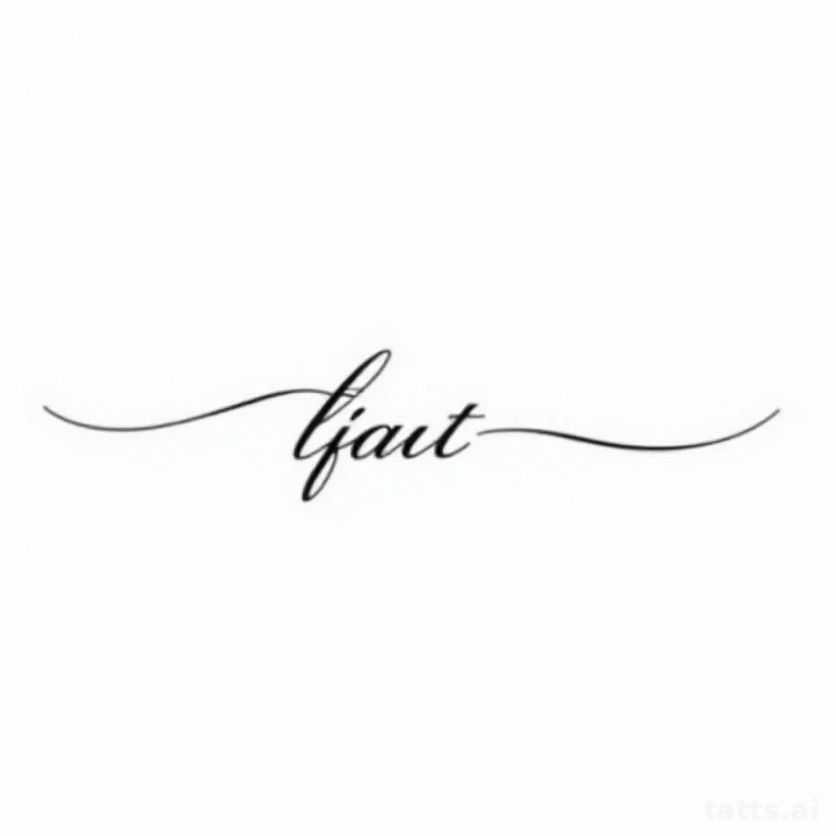
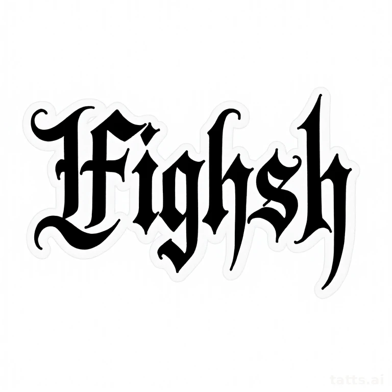
Font choice changes both the meaning and the aging profile. Thin cursive script looks elegant and personal but is the most vulnerable lettering style to blowout and fading — fine lines merge and soften fastest, especially on a forearm that flexes constantly with wrist and hand movement. Bold blackletter (gothic) or block-style lettering reads more aggressive or classic depending on execution, and holds up dramatically better over time because the thicker strokes resist the ink migration that ruins fine script. If longevity matters more to you than the delicate look of thin script, this is the single biggest lever you control.
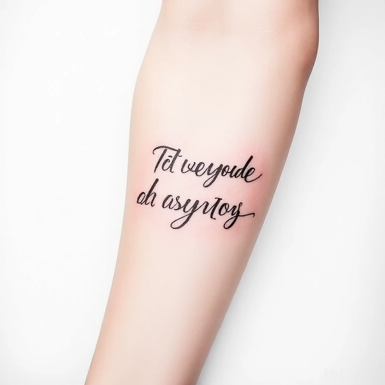
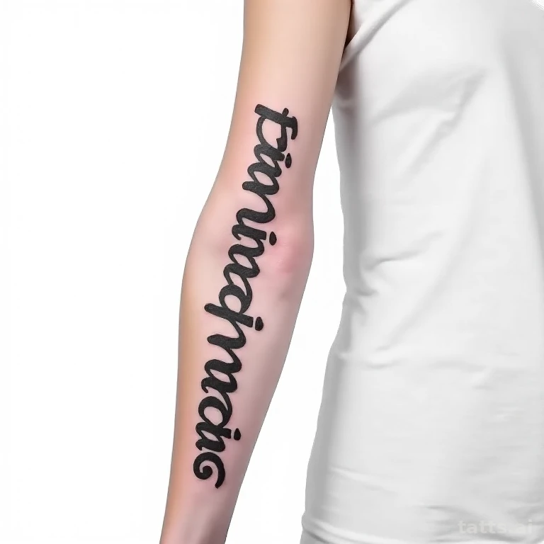
Placement on the forearm also matters for legibility over time: the outer/top forearm is flatter and less mobile, so lettering holds its straight baseline better there than on the inner forearm, which flexes more with every wrist rotation. Vertical lettering running from wrist to elbow reads dramatically but is harder to read at a glance since most people's eyes scan horizontally; horizontal lettering wrapped partway around the arm is more universally legible but needs the arm held at a specific angle to read as one line. Pain is on the milder end for outer forearm lettering, 3-4/10, rising to 5-6/10 on the inner forearm where the skin is thinner and more sensitive. A short phrase or name (under 15 characters) in bold script finishes in under an hour; longer quotes can run 2-3 hours depending on size and font complexity. Bold lettering styles hold sharp readability for 15-20+ years; fine cursive script typically needs a touch-up by year 5-7 to keep letters from blurring into each other.
Lettering Forearm designs
Generate your own lettering forearm design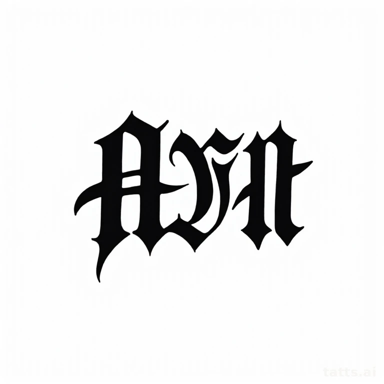

Font Weight Determines How Long It Stays Legible
The single biggest mistake in forearm lettering is choosing a font purely for how elegant it looks in a reference photo without considering stroke weight. Thin, delicate script fonts are gorgeous fresh but the individual strokes are often thinner than the minimum line width that holds up well in skin over a decade — by year 6-8, thin letters can bleed into each other and become unreadable, especially at smaller point sizes. A skilled letterer will often suggest thickening key strokes or bumping up overall size specifically to protect long-term legibility, even if it changes the font's original look slightly.
Spacing and Line Placement for Multi-Word Phrases
Longer phrases need deliberate line-break planning — cramming a full sentence into one continuous line around the forearm often forces the font size down to the point where it won't age well. Breaking a quote into two or three stacked lines, sized generously, both reads more clearly day-to-day and holds up better long-term than one tiny continuous wraparound line. Discuss line breaks with your artist before the stencil is finalized, since awkward breaks (splitting a word badly) are hard to fix after the fact.
Frequently asked
- What font styles age best on a forearm?
- Bold blackletter, block serif, and thick brush-script styles hold up best because their stroke width resists the natural ink migration that happens over years. Thin cursive and delicate script look elegant fresh but are the most likely to need a touch-up within 5-7 years.
- Should lettering run vertically or horizontally on the forearm?
- Horizontal or slightly angled lettering is generally more legible day-to-day since it matches how eyes naturally scan, while vertical lettering (wrist to elbow) makes a bolder visual statement but requires turning the arm to read comfortably. Choose based on whether you want it to read easily at a glance or work more as a striking visual element.
- How much does a short lettering piece typically cost compared to imagery?
- Lettering is usually priced lower than detailed imagery of the same size since it doesn't require shading passes, but pricing depends heavily on font complexity and whether decorative flourishes or an accompanying small image are added. A simple single-word piece is often a shop's minimum-charge tattoo.
Make it yours
Generate a one-of-one lettering forearm design free — then try it on your skin.